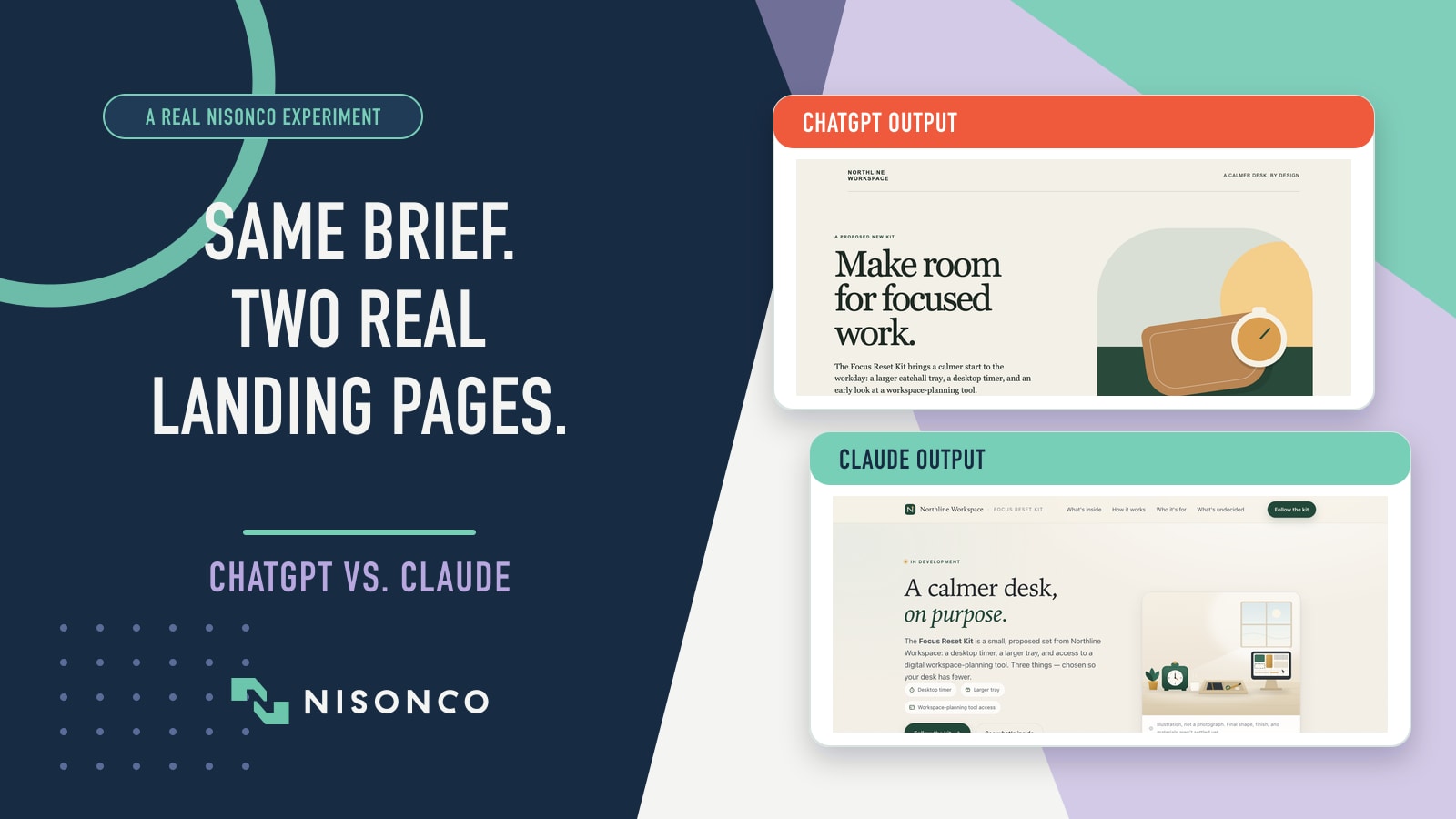
We gave ChatGPT and Claude the same concise brief for a fictional product landing page. Both produced real, self-contained HTML with clear calls to action.
We then opened the original pages at matched desktop and 430-pixel phone widths, clicked every call to action and inspected the code behind them. Below, you can explore both pages, see where each one was stronger and use the same five-part checklist to review AI-built web work before it goes live.
What We Found
ChatGPT produced the stronger first-screen design. Claude produced the more complete, mobile-stable page. But neither included a working way to capture a lead.
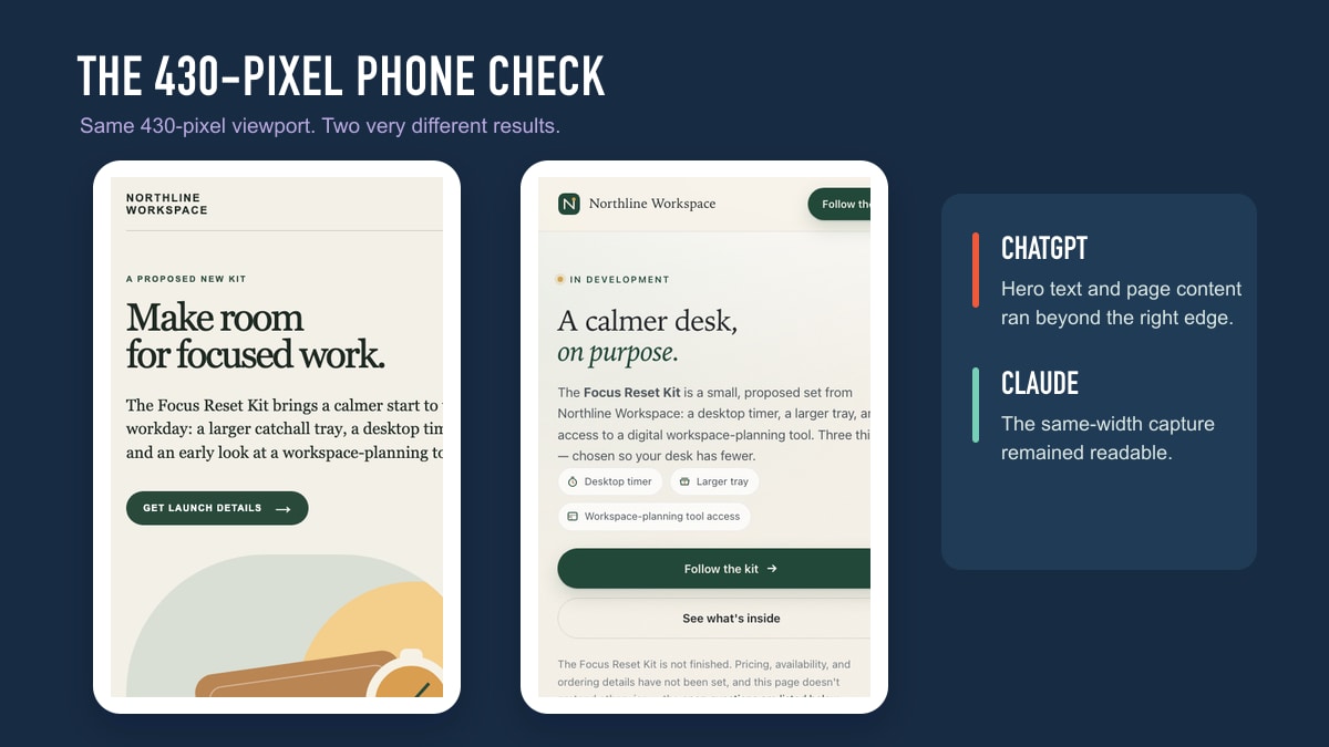
At a glance, both pages looked ready to use. In practice, ChatGPT's two “Get launch details” buttons went nowhere. Claude included an email form, but it had no destination or submission logic. ChatGPT's page also overflowed at the matched 430-pixel phone width.
That is the practical gap this article examines: a page can look finished before the parts a customer and the business rely on actually work. Visual design, mobile behavior, factual discipline, accessibility and conversion logic each need their own release check.
Northline Workspace and its Focus Reset Kit were fictional. We ran the test on August 7, 2026; the two outputs were labeled ChatGPT Sol and Claude Opus in the test materials.
Quick Takeaways
– Deliverable: Both outputs were real, self-contained single-page HTML landing pages.
– Visual direction: Our review preferred ChatGPT's first-screen design.
– Mobile behavior: Claude's page held together in the matched 430-pixel capture; ChatGPT's page showed right-edge overflow.
– Conversion path: ChatGPT's CTA buttons did nothing; Claude's email form also had no submission path.
– Proper scope: The evidence supports a comparison of these two pages, not a universal model winner.
See the Two AI-Built Landing Pages
These are not static design comps. They are the original, working-in-the-browser HTML files produced in the experiment.
Get the next real-world test
Want practical AI, SEO and marketing findings in your inbox?
NisonCo shares useful experiments and analysis in our biweekly updates. Joining is optional. Both original pages remain available without an email.
No email required. Click either screenshot to open and explore the original page.
 Open the live ChatGPT page Claude outputMore complete handoff
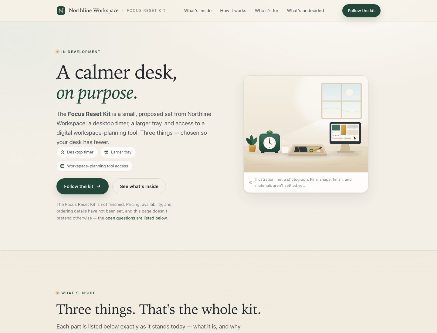 Open the live Claude page
 Same concise brief. Two real HTML outputs. Open either page and test it yourself.
What We Asked ChatGPT and Claude to Build
We asked both tools to build a one-page landing page for the same fictional desk-organization product.
The page needed to explain the product, identify who it was for, give visitors a clear next step and work on both computers and phones.
We gave both tools the same do-not-invent list. They could not make up a final price, shipping or return policies, guarantees, customer testimonials, claims that it worked with other products or promises that it would improve someone’s health or productivity.
After both pages were created, we opened them at the same desktop and phone sizes. We compared their design, phone layout and the accuracy of the information. Then we clicked every button and tried the form to see what actually worked.
This was one small, practical test, not proof that one AI is always better. We also did not record elapsed time, token use, cost, retries or editing time, so this article does not compare those metrics.
ChatGPT vs. Claude Website Results at a Glance
| Check | ChatGPT-labeled output | Claude-labeled output |
|---|---|---|
| Pages generated | One self-contained landing page | One self-contained landing page |
| First-screen design | Our preferred visual direction | More conventional and information-dense |
| 430-pixel mobile capture | Visible right-edge overflow | Layout remained readable |
| Major issues found in our checks | Two issue types: mobile overflow and no working CTA | One issue type: no working form submission |
| Working lead-capture paths | 0 of 2 CTA buttons | 0 of 1 email form |
| Made-up prices or policies found | 0 | 0; also listed unresolved decisions explicitly |
| Front-end handoff detail | Lean prototype | More navigation, metadata and accessibility detail |
Those are the useful comparisons this run supports. Time, cost, token use, retries and correction time were not recorded, so we disclose those gaps instead of estimating them.
Where ChatGPT's Design Was Stronger
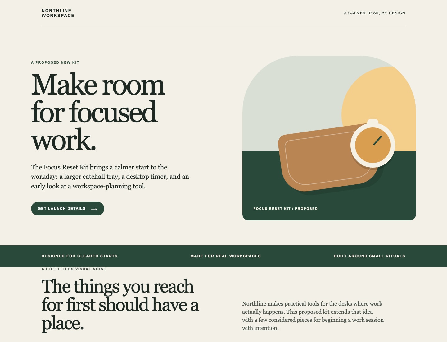
ChatGPT's page communicated the product quickly. The large editorial headline, restrained color palette and CSS-drawn product scene gave the hero a distinct point of view. The hierarchy was simpler, and the offer was easy to understand without scrolling.
This is a useful strength at the concept stage. A founder or designer can react to a clear direction faster than to a page that tries to resolve every detail at once.
The tradeoff appeared in the matched 430-pixel mobile screenshot. Text and page content extended beyond the right edge. The page included a mobile media query, but the rendered result still failed the actual viewport check.
That distinction matters: responsive code is not proof of a responsive page. The viewport is the test.
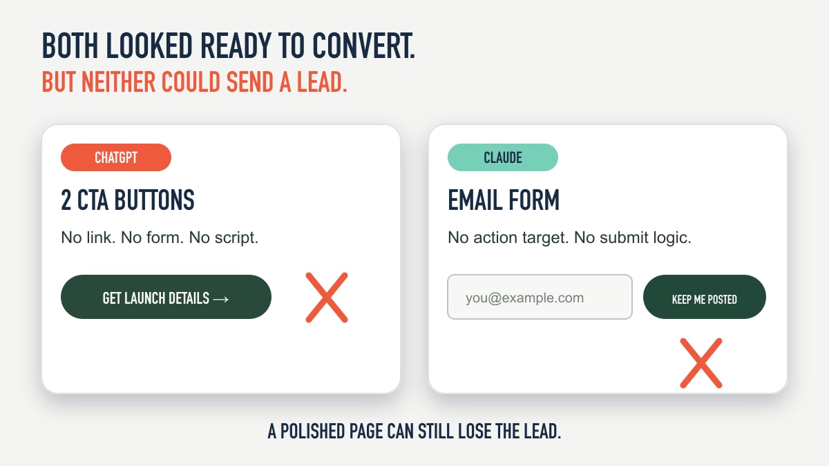
But the two primary CTA controls were plain buttons without links, form controls or scripts. They looked finished while doing nothing.
Where Claude's Website Was More Complete
Claude produced the more developed front-end handoff.
Its page included section navigation, a skip link, a meta description, reduced-motion handling, semantic sections, more detailed inline illustrations and a dedicated “what we haven't decided yet” section.
That last section was especially strong. It told the reader that price, launch timing, shipping, software-access duration, dimensions, materials, returns, warranty and outcome claims were still unresolved. Instead of quietly filling gaps, the page turned uncertainty into visible content.
Claude also stayed within the matched 430-pixel mobile capture. The hero, controls and illustration remained readable at the width where ChatGPT's page overflowed.
The tradeoff was length. Claude's page explained far more than the brief required. For an early creative review, that can make the direction slower to scan and harder to edit.
Its conversion control was more realistic but still incomplete. The page included an email input and “Keep me posted” button. The form had no action target and no script to capture, validate or send the address.
The Hidden Production Gap Both Pages Shared
Both pages passed the glance test. Neither passed a production conversion test.
The original prompt required a clear call to action, not a live backend or external integration. This is therefore not a prompt-compliance failure. It is the clearest reason to call both outputs prototypes rather than production websites.
This is exactly the kind of AI-generated error a screenshot review can miss. A button can look clickable. A form can accept text. A browser can render the page without an obvious error. None of those facts prove the business will receive the lead.
For ChatGPT, the missing behavior was visible in the source: two <button> elements, no surrounding form, no link destination and no JavaScript.
For Claude, the page had a <form> and a submit button, but no action destination and no submission handler. Pressing the control could not complete the promised request.
Neither output invented the final price or prohibited customer policy, which is worth crediting. But factual restraint does not substitute for working business logic.
The broader lesson is not that one model “won.” It is that visual polish, responsive behavior, factual discipline and operational completeness need different QA steps.
Did ChatGPT and Claude Build Full Websites?
They are complete single-page front-end landing-page files. They are not full production websites in the way most businesses use that phrase.
Neither output included a content-management system, analytics, working lead capture, database, authentication, ecommerce, legal-policy integration, hosting configuration, domain setup, monitoring or maintenance plan. The prompt intentionally excluded dependencies and remote services, so some of those omissions were expected.
Calling them “mockups” would also undersell the work: the HTML and CSS rendered as real pages. The accurate label is self-contained landing-page prototypes.
Current product capabilities continue to evolve. OpenAI now documents shareable ChatGPT Sites, while Anthropic documents single-page HTML websites among Claude Artifacts. This article evaluates the two landing pages created in our August 7 test, not every feature available in either product today.
A Five-Part AI Website Handoff Checklist
Before an AI-generated page reaches a customer, verify five different layers:
– Offer clarity. Can a first-time visitor explain what the business offers, who it is for and what happens next?
– Factual discipline. Trace every price, policy, promise, compatibility statement, testimonial and performance claim to an approved source.
– Responsive behavior. Test real rendered widths, not only the presence of media-query code. Include the smallest supported phone, long headings and zoomed text.
– Conversion behavior. Click every button, submit every form, confirm validation, check the destination and verify that the business actually receives the data.
– Production foundations. Review accessibility, metadata, analytics, privacy, security, hosting, error handling, content ownership and maintenance before launch.
A useful prompt addition is: “Do not call the page complete until you have tested every CTA and listed any behavior that still requires a backend, integration or business decision.”
That will not eliminate the need for QA. It makes the missing work harder to hide behind the design.
What This Test Does and Does Not Prove
The evidence supports several narrow conclusions:
– Deliverables: Both labeled outputs are real, self-contained landing-page files.
– Visual review: Our identity-aware review preferred ChatGPT's first-screen direction.
– Phone-width check: ChatGPT's page overflowed in the matched 430-pixel capture; Claude's stayed readable.
– Conversion behavior: Neither page could submit a lead.
– Factual restraint: Neither page introduced the final price or prohibited policy claims in the brief.
The evidence does not support a universal ChatGPT-versus-Claude ranking, a speed or cost comparison, an isolated base-model conclusion, or a claim that the run environments were identical.
There was one output per label and one fictional product. The review was not blind. We did not record session conditions, retries, timing or correction burden.
Those limitations do not erase the useful artifact findings. They define their proper scope.
The Metrics This Historical Run Did Not Preserve
– Elapsed time: Not recorded, so we cannot make an honest speed comparison.
– Subscription cost per output: Not attributable from the available records or a flat subscription price.
– API-equivalent cost: Not defensibly estimable without actual token usage and an exact API-model mapping.
– Human correction time and retries: Not recorded.
A future controlled rerun should preserve timestamps, plan and model settings, token usage, retries and hands-on correction time. That would support a real speed-and-cost comparison instead of false precision.
The Bottom Line
ChatGPT gave us the stronger visual concept. Claude gave us the more complete, mobile-stable page. But when a visitor used the CTA, neither page sent anything to the business.
If the goal is creative direction, the shorter ChatGPT page was easier to react to. If the goal is a more developed handoff for team review, Claude covered more of the necessary front-end detail. In both cases, a human still needed to test mobile rendering, wire the conversion path and complete the production stack.
Do not ask only, “Did the AI build the page?”
Ask, “What happens when a customer tries to use it?”
For a wider product comparison, read ChatGPT Work vs. Claude Cowork: Which Is Better?.
Frequently Asked Questions
Can ChatGPT and Claude build a website from a prompt?
Both created a real, self-contained single-page landing-page file in this test. A production website usually requires additional work such as functioning forms, analytics, accessibility review, privacy and legal controls, hosting, monitoring and ongoing maintenance.
Which was better for website design: ChatGPT or Claude?
In this artifact comparison, our visual review preferred ChatGPT's first screen. Claude produced the more complete and mobile-stable front-end handoff. Neither result supports a universal winner.
Did ChatGPT and Claude receive the same website prompt?
Yes. We used the same fictional brief and exact prompt for both outputs. Because session conditions were not recorded, we do not claim the runtime environments were identical.
Did both AI-generated websites work on mobile?
No. In the matched 430-pixel captures, the ChatGPT page visibly overflowed at the right edge. Claude's page remained readable. This was one viewport check, not a complete device lab.
Did the forms and buttons work?
No. ChatGPT's two CTA buttons had no destination or submission code. Claude's email form looked more complete but had no action target or submission handler.
Did either model invent a price or policy?
Neither output stated the final price or introduced the return, replacement, shipping, compatibility or testimonial claims prohibited by the brief. Claude went further by explicitly listing many unresolved decisions.
Does this prove ChatGPT or Claude is better at building websites?
No. It compares two outputs from one fictional landing-page task on August 7, 2026. A current model ranking would require fresh isolated runs, authenticated settings, attempt logs, timing, cost and blind review.