
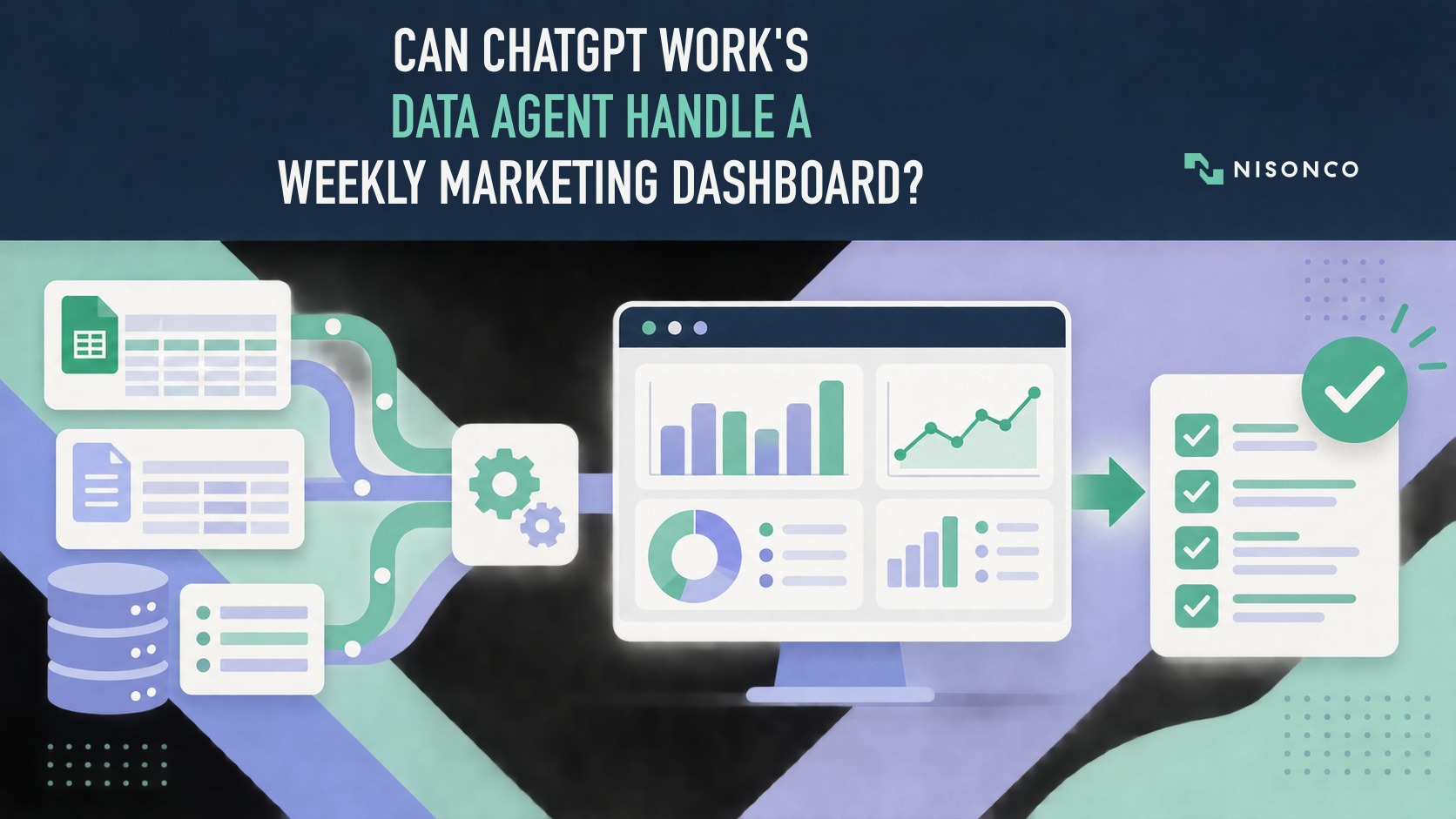
OpenAI’s Data Agent is designed to analyze connected business data and produce shareable dashboards. That makes weekly marketing reporting an obvious use case. It does not make the result trustworthy by default.
A useful dashboard has to pass five checks: the metric definitions are correct, the source data is current, the calculations match independently calculated totals, the citations are traceable, and the output respects the intended permissions. Until those checks pass on a representative dataset, the Data Agent should be treated as a trial, not an analyst replacement.
This guide explains what OpenAI says the product can do and how a marketing team can test it without exposing production or client data.
Product documentation was checked September 20, 2026. Capabilities, supported data sources, plan access, and permissions can change, so confirm the current setup before connecting business data.
The quick answer
- The Data Agent may reduce the repeated work of querying data, assembling a dashboard, and drafting a weekly summary.
- Vendor capability claims are not proof that it will calculate your metrics correctly.
- Start with sanitized or synthetic data and questions whose correct answers are already known.
- Evaluate accuracy, source links, permissions, retries, and correction time—not visual polish alone.
- Keep human review for business context, causal explanations, exceptions, and consequential decisions.
What OpenAI says the Data Agent does
OpenAI describes the Data Agent as a way to connect approved data sources, use business context and semantic information, investigate changes, and create interactive dashboards while respecting source permissions.
That is the vendor’s product description. It establishes what the product is intended to do, not how accurately it will handle a particular company’s definitions, schema, connectors, or data-quality problems.
The distinction matters because a dashboard can look complete while using the wrong denominator, time window, attribution rule, or join. Weekly reporting is only faster when it also requires less review and correction.
Why metric definitions come before the agent
Marketing terms are rarely universal. One company may define a lead when a form is submitted. Another may require qualification. Customer acquisition cost may include media only, or media plus labor and software. Return on ad spend may use booked revenue, collected revenue, or a modeled attribution value.
Before an agent can answer a question consistently, the team needs an approved definition for each metric. That definition can live in a semantic layer, a documented reporting model, or another source of truth appropriate to the company’s systems. The important requirement is not a specific vendor tool. It is that the agent receives definitions that can be checked.
For each metric, document:
- the formula;
- the allowed source tables or files;
- the time grain and timezone;
- filters and exclusions;
- attribution rules;
- known data delays;
- the owner who can approve a change.
Without those decisions, the system is being asked to infer company policy from raw data.
A safe weekly-dashboard pilot
1. Use sanitized data with known answers
Production analytics and client records are unnecessary for the first test. A synthetic dataset can include realistic channels, spend, leads, conversions, revenue, and a few deliberate anomalies. Calculate the expected answers before the agent sees the data.
A useful pilot keeps the source data, metric definitions, fixed questions, and expected answers separate so a reviewer can identify a real calculation error rather than debate an ambiguous prompt.
2. Freeze the weekly questions
Choose a small set of questions that reflects the real reporting job. For example:
- What were spend, leads, conversions, and revenue this week?
- How did each metric change from the prior week?
- Which channel contributed the largest increase or decline?
- Did any result fail a defined threshold or data-quality check?
- Which source rows support the summary?
Do not add easier questions after seeing the output. A useful test includes failures and retries when the team reviews the final result.
3. Limit permissions
Give the pilot access only to the source required for the test. Keep it read-only. Record the account, role, connector, enabled tools, and sharing boundary. Do not connect email, CRM, ad accounts, financial systems, or client data merely to make the demonstration feel realistic.
Permissions are part of the result. A correct dashboard is not useful if producing it requires access the team would not normally approve.
4. Compare with a transparent baseline
Use a spreadsheet or another repeatable calculation as the baseline. The point is not to declare that a person is infallible. It is to create a visible calculation path that can be checked when the outputs disagree.
Compare the agent’s dashboard with the expected results for:
- exact totals and rates;
- period comparisons;
- correct metric definitions;
- source traceability;
- handling of missing or anomalous data;
- readable labels and units;
- required caveats.
5. Count the work needed to make it usable
Record every retry, clarification, correction, and manual edit. Measure elapsed time and reviewer time separately. A dashboard that appears quickly but requires extensive verification may not reduce the actual weekly burden.
A useful planning measure is:
Total cost of a usable dashboard = allocated tool cost + additional usage + setup time + review and correction time
One run cannot establish universal reliability. Report the date, account, connector, dataset, questions, sample size, failures, and limitations.
What should still be reviewed by a person?
Business explanations
An agent may identify that leads fell or acquisition cost rose. It cannot know whether the cause was a delayed invoice, an offline event, a tracking change, or a strategic decision unless that context is present and correctly interpreted.
Data freshness and missing records
A plausible chart can hide a delayed source or incomplete period. Reviewers should confirm the extraction time, expected row counts, and known reporting delays before circulating the summary.
Exceptions and causality
Correlation is not a diagnosis. Treat generated explanations as hypotheses to check, especially when the dashboard will influence budget, staffing, or client communication.
Audience and permissions
Before sharing a dashboard, confirm that every recipient is allowed to see the underlying information and that the artifact does not reveal details outside its intended scope.
Where the Data Agent fits
The strongest use case is not “replace the analyst.” It is to reduce the repetitive, definition-sensitive work around a recurring question set while keeping verification and business judgment visible.
That also distinguishes a dashboard agent from a general company knowledge system. NisonCo’s guides to an AI second brain for business and a second-brain app versus a custom AI knowledge base address how information is organized and retrieved. A weekly dashboard adds calculations, time periods, source traceability, and a clear final review before it is shared.
For a broader overview of current assistant capabilities, see ChatGPT and Claude features for business owners.
The bottom line
The Data Agent is promising for recurring marketing reporting because the job is structured, repetitive, and grounded in known data. Those same qualities also make it testable.
Do not judge it by whether it creates a polished chart. Judge whether the numbers and definitions match independently calculated expectations, whether the sources are traceable, whether the permissions are acceptable, and how much human correction remains.